A design system is not just a style guide or a simple library of components. It is a single point of contact that brings together all the elements needed to create a consistent, scalable experience across all of a company's media.
Dassault Systèmes
White Label Design System
Product Management
UX/UI Design
Leading the creation of a white label design system for 13 brands, this project delivered a unified, scalable and fully WCAG AA compliant toolkit. The result: stronger multi-brand consistency, faster onboarding and a smoother, more enjoyable design workflow.
State Of The Art
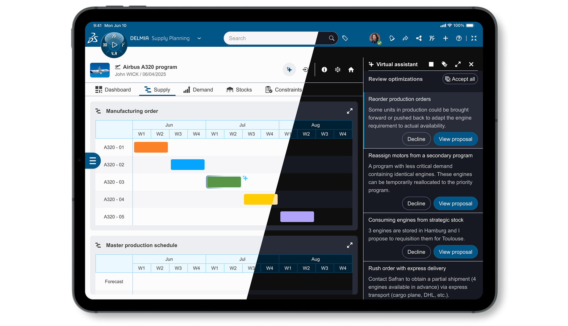
Move from a UI Kit to a large‑scale design system
What did we have before?
- A static approach was still in place, with styles and components shared in PDF spec format.
- Significant disconnect between designers and developers.
- Guidelines that sorely lacked a solid, accessible foundation.
Our Vision
My white label approach
At Dassault Systèmes, our ecosystem spans 13 brands and millions of users across industries as diverse as aerospace, manufacturing, and life sciences. Designing for such a vast and varied landscape requires a system that is as adaptable as it is consistent. Our design system is built on five pillars: cross-brand, cross-device, cross-technology, accessible, and AI-friendly, ensuring every experience feels coherent, inclusive, and future-ready, whether it lives on a 4K display, inside a VR headset, or on a watch-sized industrial interface.
Cross-Brand
Cross-Device
Cross-Technology
Accessible
AI-Friendly
And this vision comes to life through our new design system: "Cube Design"
Why Cube Design?
We needed a name that captures the essence of who we are. The cube represents the fundamental 3D unit — a universal building block. And as we are the 3DEXPERIENCE company, it perfectly reflects our mission.
Acculturation
I started by building culture, not components
Before Cube Design took shape in Figma, my first mission was to bring people on board helping designers, developers, and product teams understand what a design system truly means and how it can transform the way we create.
In 2024, we introduced Figma as our new design platform, training stakeholders and establishing new ways of working together. This early investment in education and alignment became the foundation for everything that followed.
Tokenization Approach First
Healthy foundation for all
I translated design into a common language. Design tokens, colors, spacing, and styles, became shared values readable by both humans and machines, designers and developers alike.
Our new language 👇
The mnemonic story 👇
From this foundation, I created a living library of design tokens, bridging the gap between design and development, ensuring accessibility by default, and powering new features such as our unified light and dark modes.
1 956 Design tokens created
25 Token categories
Before
After
Primary
2.83 : 1 ✕ AA
7.84 : 1 ✓ AA
Light & Dark Mode Demonstration
Small Demo
Unlimited possibilities unlocked
Thanks to this architecture, I moved from a simple primary button component to an ultra-flexible component that adapts to all brands and all possible contexts of use in the industry.
DesignOps
Scaling under control
To ensure our design system scales sustainably, I adopted a DesignOps-driven approach focused on measurement and integration. I also defined key KPIs to track user satisfaction, design coverage for adoption among designers, and code coverage to assess developer usage.
User satisfaction is key, and I measure it with a CSAT.
Designers must use the components provided (and not detach them).
No more pixel-perfect code — we use tokens for everything.
I built a two-way delivery process that keeps design and development in sync, powered by a style dictionary that translates our token base into consistent experiences across every framework and device.
using your design system makes sense for me since it seems to be a more flexible approach and i'm happy to share my opinion along the way.
Documentation
Source of truth for all
I created a living documentation to connect all contributors. Using a Markdown-based doc generator that I re-engineered for our needs, the platform is dynamic and collaborative by design. Markdown makes contribution simple for everyone, while built-in customization and automation ensure quick access to information and instant copy-paste shortcuts for tokens, icons, and more.
Today and Tomorrow
What the system has shipped
The foundation is live. Two years of work, 13 brands, one coherent system. All tokens, components, and assets under a single source of truth, actively reused across brands designing patterns and prototypes specific to their industries.
145
Components +1000
VariantsWith these building blocks stable and adopted across the organisation, a new question emerged: what more could we unlock if AI became part of the daily workflow?
Generative AI
Building on the foundation
With Cube Design in production, I took on a new challenge: making LLMs a practical, everyday tool for designers and developers working inside the system — reducing production times and raising the quality of deliverables.
Key missions
Train
LLM in general Best practices Use of MCPs Prompt engineering
Code
Building our own agents with APIs Popularize APIs for designers
Automate
Environment configuration Rules · Prompts · Tools · Docs
Simplified Environment
This is the type of environment I set up for the brand's designers and developers. For security reasons, a complex configuration was required in Visual Studio Code, along with integration of our own internal model. Despite these constraints, we deployed working agents and continue improving them daily to maximise their impact.
Thanks for reading!
Let's connect! I'd be glad to tell you more about Cube Design and what's next.
✉ arthur@carreton.fr